A Design Blog of Feng Shui Designer Sherry Burton Ways

Posts tagged ‘Color Therapy’

Five Ways to Implement Color Psychology for Productivity in the Office

OfficePhoto

Colors can have a great impact in your workplace can stimulate productivity and keep our employees happy. Colors evoke feelings and these can have a dramatic effect on the visitors and stakeholders as well. The effect of color on moods and behavior is called color psychology and the use of color psychology can help create a work environment conducive to productivity.

????????????????????????????????????????????????????????????????????????????????????????????

Here are five easy ways to implement color psychology for productivity in the office:
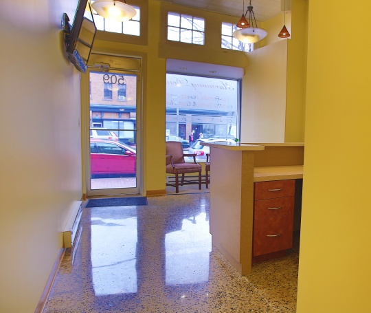
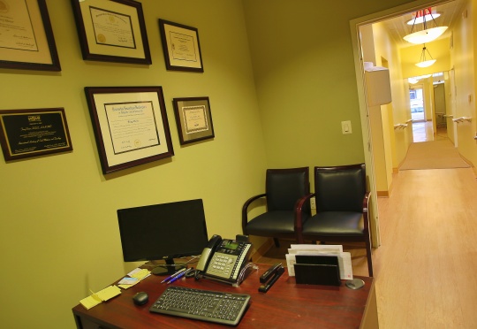
1. Reception Area

The reception is the first point of contact a visitor, prospective employee or a current employee will have in a office. The reception should radiate a feeling of happiness and positivity. The person entering your reception area should feel welcome. Orange is a great color for receptions since it evokes a feeling of enthusiasm and energy. You can also use a peach or soft yellow for the reception area.

2. Office Space

The office space is where the employees spend their working hours. The area should be able to stimulate the employees to put in their best and not slack in their performance. Blue is generally perceived to be the ‘most productive color’. It is a calm color that creates a relaxing atmosphere. It is especially suited for employees who do number crunching work like accountants. Too much of blue can get boring, adding red or orange as accents will maintain a balance. Similarly, if your work is creative in nature, choose yellow instead of blue. Yellow is associated with the Sun and instills a creative energy in the office area. It is positive and optimistic color thus suited well for designers and creative minds.

3. Meeting Rooms

Meetings rooms are generally used for big announcements or making important decisions. Avoid using the color red completely in these rooms. Red is a color that gets the heart racing and people agitated. A good color for meeting rooms is turquoise. It helps in soothing the nerves of nervous speakers. Inject a shade of pink to help people in the meeting room feel at ease and avoid tempers from flaring.
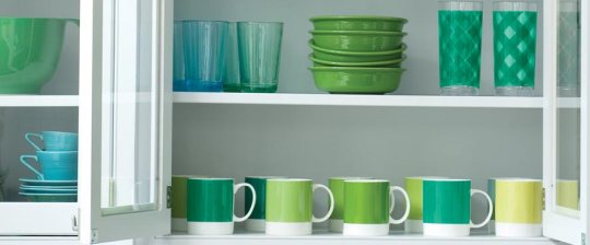
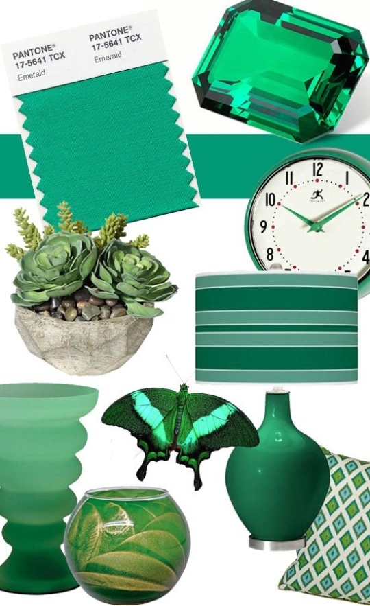
4. Café or Pantry

If you have a small café or pantry in your office area where your employees usually head to for a coffee break, consider using shades of green to create a relaxing atmosphere. Green is a soothing as well as reassuring color. It creates a sense of balance and the employees will feel refreshed on returning from their break.
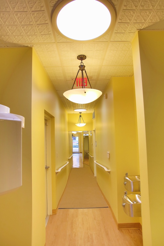
????????????????????????????????????????????????????????????????????

5. Hallways

White can feel like a blank slate and is perceived to be a boring color to use in the workspace. White can make hallways appear brighter and more spacious. Use white in hallways to create a feeling of optimism and cleanliness.

Decorating with Pantone’s Color of the Year- Radiant Orchid

Whether you are someone who seeks inspiration from trends or someone who believes in creating their own trends, you cannot miss Pantone’s color of the year- Radiant Orchid.  A gorgeous mix of purple and pink, Radiant Orchid will require you to stretch your creative thinking abilities.  It is a charming color that is packed with energy and luxurious charm.

Pantoneradiantorchid

Here are a few ideas to introduce Radiant purple in your home decor:

1.  Splashes here and there-

If you are afraid to incorporate the color of the year in your decor, the easiest way is to introduce splashes of the color here and there.  When you “grow into” the color, you can choose to move to the next level or eliminate it all together.  Next time you visit the florist, pick a bunch of purple orchids and voila, you have just added the trending new shade into your home decor.

RadiantOrchidLeatherChair

2.  Use as a luxurious accent-

Although Radiant orchid is a bright and vivacious color, it will be a bold decision to cover your entire room in this shade of purple.  The color can get boring very easily, therefore it is best to use it as an accent.  Radiant orchid radiates a royal feel and luxurious fabrics like velvets and damasks that incorporate this shade of purple will work well for upholstering ottomans and dining chairs.  You can also drape your armchair with a mohair throw in radiant orchid for a touch of opulence.

RadiantOrchidFabric-1

3.  Not so feminine-

A lot of people are afraid of the pink undertones in radiant orchid.  It is being touted as a feminine color for interiors.  But the great thing about Radiant orchid is that is can easily swing between feminine and very masculine.  Use radiant orchid in conjunction with reds, yellows, and oranges to bring out its charming, feminine side.  But the color becomes very masculine and bold when paired with glossy blacks, grays and dark browns.

4.  In the kid’s bedroom-

If there is one room in your home that can pull off a coat of radiant purple from ceiling to floor, it is the kids’ bedroom.  The color is bright and will bring energy to the room.  When painting the entire room in radiant orchid, it is important to keep the other decor muted.  White works best with radiant orchid in the kids’ room.  Remember, too much of color can be disturbing for the child.

5.  Cool off the kitchen-

Radiant orchid is a beautiful mix of blue and red.  The blue hue in the color has a cooling effect, therefore it is very well suited for use in the kitchen.  Consider using cabinets with a glossy Radiant orchid finish paired with black and white.  You can also paint an accent wall in the kitchen in this shade to add a punch.

Interested in learning how to incorporate the 2014 Color of the Year in your home?  Contact us today at interiors@kreativeways.com and we will set up a free 20 minute phone consultation!

National Color Therapy Month Feature: Choosing The Right Color Palette

sherry  24
Color is emotional and conveys different moods, this being said the color of a room determines the type of atmosphere. Choosing the color of a room can be both nerve racking and intimidating. So many colors, tones and hues oh my! Well I have a few tips to make it easy you see. So grab a pen and follow these:
1. Determine the function of the room.

  • Deep colors should be used in rooms primarily used at night, the dining room, TV room or bedroom.
  • Light colors go great in rooms with a large amount of natural light. Subtle, pale colors in bathrooms or dressing rooms.
2. Test the colors effectively.
  • Hang large paper color swatches next to smaller trim colors and view the shades together.
  • View the color combination together at different times of the day to see how the color appears in different lighting.
3. Prepare to be surprised.
  • Testing a color won’t completely prepare you for a big change. Some color will appear brighter or bolder in a large amount. If your feeling apprehensive about using a color, try using it in small amounts through out a room. Decorative throw pillows or throw blankets in a living room or bedroom, table clothes, plates and napkins in the eat in kitchen or dining room in the prospective room color can help you slowly adapt to using the color in a great amount.

Announcing The 21 Day Essential Interior Color Challenge Starting March 10th!

ColorChallenge

National Color Therapy Month Color Challenge! Join us for the Essential 21 Day Interior Color Challenge!

March 10- 21, 2013

Are you ready to tap into the wisdom of  color and how to use it for your interior?

Kreative Ways & Solutions, LLC presents the best interior color challenge yet—The Essential Interior Color Challenge!

Participate with us each day on this journey toward understanding how to use color to restore balance, energize your interior and create a beautiful interior space.   The Essential Interior Color Challenge helps you to embrace the vision of interior color, expand your understanding of how to use colors in your interior and achieve greater balance and well-being.

Starting Sunday, March 10th, this ALL NEW, interior color journey is free and open to everyone! We encourage you to invite your friends and loved ones to join you and experience:

  • Daily tips on how to use color in your home.
  •  Questions answered about your toughest interior color questions!
  •  A  community of like-minded individuals exploring the gifts of interior color!

There is no charge to participate in this learning experience.  Sign Up for our 21-Essential Interior Color Challenge— by subscribing to our Newsletter here BEFORE March 10th!

BONUS:  We invite you to join us to create a National Color Therapy Month Pinterest Board!

The Pinner who places the most pins on our board wins a 20 minute Personal Development Color Consultation via phone or skype. AND you are able to participate in our 21-Day Color Therapy Month Challenge. To enter simply join our listserv at here by March 1st.

Happy Color Therapy Month!

Our Suggestions on Using Pantone’s 2013 Color Emerald in Your Interior

We could not end the year without acknowledging the 2013 Pantone Color of the year:  Emerald.   Any color green is a healing color and we would love to know what specifically went into the selection of it. Our  colleague and friend Leatrice Eiseman states:   “The most abundant hue in nature, the human eye sees more green than any other color in the spectrum,” said Leatrice Eiseman, executive director of the Pantone Color Institute®. “As it has throughout history, multifaceted Emerald continues to sparkle and fascinate. Symbolically, Emerald brings a sense of clarity, renewal and rejuvenation, which is so important in today’s complex world. This powerful and universally-appealing tone translates easily to both fashion and home interiors.”

Umm “clarity, renewal and rejuvenation.”  Wow, that is what we like to do, create interiors that inspire you.  Globally homeowners are seeking ways to feel better in their interiors.  So this revelation is extremely interesting as you look at where Pantone is going with their color of the year choice this year.  According to Pantone, Emerald is also a color that is considered sophisticated and elegant.  Ok, so you may ask, how can I integrate such a color in my interior? Here are our recommendations:

  • Accent wall in a room where you want to emphasize healing and harmony.
  • A sofa throw, table accessories or a lamp base.
  • Consider an emerald colored  area rug to ground a room.
  • Integrate the color using artwork that may emphasize it in some way.
  • How about emerald colored draperies?
  • An accented table scape- dishes, napkins, place mats
  • Bathroom accessories

Rooms where we recommend that you use the color Emerald:

  • Bathrooms
  • Guest bedrooms
  • Master bedrooms
  • Sun rooms
  • Living Rooms:  as accents only
  • Dining Room:  as a table scape accent only

Interestingly, Pantone provides the  following quote about their color selection which very ironic yet in alignment with our design philosophy at Kreative Ways & Solutions, LLC:

“Lively. Radiant. Lush… A color of elegance and beauty that enhances our sense of well-being, balance and harmony.”

PANTONEheader_coy2013                  

PANTONE_cotyslideshow_05


PANTONEEMERALD


PANTONE_cotyslideshow_06


PANTONEenergize_thumb

PANTONEEMERALD1

Photos Courtesy of Pantone

If you would like specific recommendations on where to use Emerald in your interior for 2013, contact us today at -1-888-280-8318 or email us at interiors@kreativeways.com.

Six Strategies to Prepare for The End of The World Of Uninspired Home Design

Backyard Corner

Well it is the end of the world as we know it… well sort of.   According to the ancient Mayans, the end of the world is supposed to be December 20-21st.  However, I got news for you… the end of the world as we have known it from a consciousness level is no longer the agenda.

The year 2013  is about making a shift in the collective consciousness around the world.  In order to prepare, we will need more spiritual and energetic tools.  It is now going to be about listening to your intuition and being in touch with your spiritual self.   It is about moving to action instead of waiting for permission to move forward.

Inspired

This is a time for transformation, spirituality and understanding your place and your role in co-creating the universe.  This is the end of doing it all on your own.  It is about sharing and tapping as many resources as you can.  You will want to match your personal SHIFT with an environmental SHIFT.

To do this you must create an interior that fully supports the way you want to be, and the way you want to live in the world—one where you can really thrive and enjoy every aspect of your life, with spaces that function well, and allow you to tap into your true self and your authentic gifting.  So as you prepare mentally and spiritually for this exciting shift in the universe,  your home or office  interior must be in alignment for the abundance prepared for you in 2013.   To prepare your interior for the SHIFT here are six strategies:

  1. Discover your personal (and even professional) needs and goals.
  2. Create an action plan for setting up your interior environment so that these needs and goals will be supported and fully realized.
  3. Consider spaces that integrate personal hobbies, work, and creativity into your home.
  4. Incorporate design elements that can have an emotional and psychological effect on your well-being and productivity both within the home and outside of it.
  5. Know what your personal development colors are and how to integrate them in your interior.  There is nothing like having the right customized colors in your environment to help you thrive at your highest level.
  6. Find out what your Feng Shui Five Elemental make up is and the characteristics of your Chinese natal element chart is to be able remain balanced.

You know the trend of working from home virtually has changed the mindset of the workplace. The virtual work situation has placed us in environments where we can be stimulated to be more productive.   We now have some control over the spaces in which we work.  We want beauty around us.   Take the opportunity to shape your home office or out of home office bathed in beauty.

Tulips

Why not place fresh bouquets of  flowers or installing chandeliers in your home office in order stimulate your productivity?

To help you make that SHIFT in your interior for the post-2012 world, consider our Interior Environment Coaching and Feng Shui Design services to transform your old interior design consciousness to one that is in step with 2012 .  Our services are more than equipped to help you end the world of uninspired design to a world of spaces that inspire you.  Call us today to schedule your 30 minute FREE phone consultation at 1-888-280-8318 or email us at interiors@kreativeways.com.

Eco-Friendy Dentist Office Design in Capitol Hill, DC

This time we are showcasing the first eco-friendly, holistic dental office in Washington, DC, Harmony Dental.     See our previous post here about the history of this project.  We designed this dental office using as many sustainable materials as possible including Icestone for the countertops and surface materials for the both the bathroom and lobby desk and one of our favorite paints Devine Paints which provided us a rich palette for this project.  We used recycled bottled tin ceilings, recycled upholstery fabric for the lobby chairs and energy efficient lighting including a skylight on this project.

8u5a8301

8u5a8197(2)

8u5a8165

8u5a8289

8u5a8353

Our client and their patients are enthusiastic about this state of the art holistic interior design for a dental office.  Our first eco-friendly office we have ever designed.  Many visitors are stunned and delighted with the soothing color palette which we are known for and the delicate balance of efficiency and function.

Interested in knowing what we can design for your office?  Give us a call today at 1-888-280-8318 or email us at interiors@kreativeways.com.

Love and Marriage: Decorating Together The Feng Shui Way

Before decorating or redecorating a room in your home.  Call a meeting with your spouse or partner first.  Set the intention of what your home is to be for the both of you.  Determine first which rooms you would like to decorate or redecorate and whether or not the room is functioning at a level that you both are satisfied with.  Is it functioning efficiently and are both of you feeling productive in the space.

No matching match! Mix, don’t match. The home is an opportunity to grow as a couple or as an relationship evolves.   Mix and match décor items and furniture that suit both of your interests and activities.

Respect each other’s belongings, sacred inherited pieces and furnishings.  Find places in the home where each other’s cherished belongings will be respected and honored.

When shopping for new furniture, I always advise a couple to determine what their interior design style is first.  This can be done through researching magazines, blogs, websites and other media to identify which furniture and design styles will best suit both.  Tear out those photos you both like.  Identify using descriptors which furnishings and colors you both like.  Compromise is the name of the game.

Once you identify a design style that you both can live with, begin to list those items that you feel you need the most.  Determine needs verses wants at this stage.

Understand and work with a budget that you both agree to and stick with.  Determine whether or not you are living in a condo, house or apartment how long you will be living there and whether or not certain items are worth the investment if it is a temporary living situation.

Shop and choose items together.  Make it a date!  Make it fun and include dinner or lunch as part of it.  Choose a day where you will concentrate on one item verses another.

While typically women are drivers of décor decisions- always ALWAYS involve your partner in making the decisions.  While he may say oh go ahead and decorate, believe me he has an opinion too and it should be honored.  Keep asking questions about likes and dislikes between the two of you.

Here is a case study of a Feng Shui Design I did for a couple:

Feng shui is about creating positive energy, the right chi, within a space.  “It was my idea,” the wife, who didn’t want to be named, said. “I had done some research but wanted someone to help us with the layout and flow of the house.”

I began by guiding the couple through an intention ceremony. This process meant entering each room and stating the intention and purpose for the space. They burned sage and chanted — the wife said her husband, a Navy officer, was skeptical at first.

“My husband has been a good sport,” she said. “The ceremony got us all on the same page.”

The primary intent was to create a home that feels inviting to friends and serves as an oasis to the couple. I removed walls on the main floor to open the space and then quadrupled the number of windows, inviting in more sunlight.

The color scheme was based on personal feng shui readings performed by me. The husband, a Yin Wood type, needed more water, which was represented by blue to enhance his energy.

Home I designed for a couple using Feng Shui and Chinese astrology

Wood is stimulated by water. The wife possessed a large fire element and benefited from the water cooling her down.

“If left up to me, all the walls would have been red or orange,” the wife acknowledged. “These colors really bring a sense of calm and balance.”

Each of the chosen colors is painted on a wall in the home. They are repeated in tiny rectangular tiles, from Architectural Ceramics, arranged in a geometric pattern and mounted around the fireplace. The result is a reflective, shimmering work of art.

Usually feng shui requires window coverings.  But part of feng shui is about bringing elements of nature into the house, and the windows certainly do that.

Circles, which represent unity, infinity and completion in feng shui, appear in various forms throughout the home. The light fixture above the dining table is an assortment of rings grouped in a mirror bowl chandelier with brass detailing. Wooden accent tables and lamp shades replicate the circular pattern. All the furniture has rounded edges, alleviating any “poison arrows” that interfere with positive chi.

A transitional sofa in taupe chenille-like fabric with a micro-maze pattern is flanked by two sets of chairs. On one side are comfy accent chairs in micro-suede, complemented by dainty round satin teal pillows. On the other are two chairs with Indonesian-inspired carved mahogany frames.

The entire project, which included designing a nursery and master bedroom, took only six weeks to finish. I contribute part of the speedy completion to hiring a contractor who also studied feng shui and the fact that the couple who had a firm understanding and intention to design the space as they wanted.

“My biggest concern with feng shui was whether we could find the types of things, such as furniture, we liked in a style that fit,” the wife said. “I love the flow of the house and [my husband’s] very happy with the outcome. We want people to come into the house and feel relaxed. We want the focus to be on the person and not the furniture.”


Creating A Feel Good Space Before I Knew What It Was

A few years ago, I worked on a new home for a very special client.  This was one of my first projects as a designer.  Looking back now, it was my first project where it entailed me creating a feel good space which I did not know it at the time.  First, I decluttered her entire home and categorized her belongings as to whether they should stay or go.  I carefully worked with her to determine the significance of various items  in which the client moved in with.   I categorized her belongings and and placed aside those items that would remain verses which ones would go.

Then I worked with the client to determine what colors were considered peaceful to her.  The client stated that she liked earth tone colors.  Earth tone colors are wonderful colors to place in the home because these are the colors we see most often in our natural environment. The colors brown and a neutral color in the taupe family were chosen.  So I decorated the living and dining room of the townhome with a theme of a tropical inspired oasis.  Brown is considered a stabilizing and grounding color it as used as a color to accent her dining room which connected to her living room.  The neutral taupe color was used to complete the space.

In the living room, I worked with the client’s own furnishings and accented existing furniture  pieces with  naturally inspired bamboo pillows and a natural jute rug, an tropical inspired accent lamp, chosen based on the client’s love for travel to tropical locales, candles for her coffee table and decorated with the client’s own personal artwork and memorabilia.  For the window treatment, rather than to purchase off the shelf draperies or have custom window treatments done, I accented the client’s sliding glass door with sheer brown and beige colored fabric draped around it to frame it.  This was done because the client loved the outdoor space in her backyard and wanted that feeling to come into the interior.

Plants and nature is always a calming effect in both work and living spaces. Because of the client’s big sliding glass door which opened into a personal patio oasis of nature including plants and trees.  I took advantage of the natural environment in her backyard, by placing the clients plants around the living area to take advantage of the light coming in from the sliding glass door.  Lastly, to create a calming and peaceful space, I added a floor mounted water fountain.  The sounds of the water fountain and the feel of it created a calming yet peaceful space the client was after.

During the process the client stated:  ”I absolutely love the way the place is coming together. My investment club thinks my home is awesome. They describe it as warm, intimate, and peaceful. Working with you has been one of the best decisions I have ever made.” Homeowner, Washington, DC

After reflecting on this project, I just realized what I gift I had to create something special.  Something that made someone’s life much more peaceful.

Fall Fashion Forward Your Home With Color!

How do you describe the décor of your home? It is stylish and chic? Does it have a more traditional feel to it? Does your home reflect the same taste you have in clothing? Your home’s décor can often mimic your own personal style in fashion.

According to the nation’s top fashion designers, the fall fashion colors are sensible and spirited. They are contrasting warm colors with cool metals, mixing old influences with the new, and creating balance between the colors. So Pantone declares this season’s hottest fall colors for fashion are as follows:

  • Bamboo, which is reminiscent of the warmth of a yellowish-green hue of an autumn sunset.
  • Emberglow or Sienna emulates the glow of a fire from the fireplace on a cool November night.
  • Honeysuckle is a reddish pink shade that carries over from the spring. It’s playful and can be paired with any of the other colors, especially Bamboo.
  • Phlox is a deep, mysterious purple that tends to get a lot of attention alone, but adds drama to Deep Teal, Coffee Liqueur, and especially Bamboo.
  • Cedar is a versatile neutral shade with a green undertone. It w   compliments Phlox, Deep Teal, and Orchid Hush.
  • Deep Teal is a very dark bluish green that is compared to deep ocean waters and the sky when night falls. It is a very exotic color that meshes well with Cedar and Honeysuckle.

  • Coffee Liqueur is an elegant color that adds neutrality to any tone.
  • Nougat is a warm camel tan that enhances Emberglow, Phlox, and Honeysuckle greatly.

  • Orchid Hush is a very light lavender with a grayish undertone which can be matched with any other color on the palette.
  • And last but not least, Quarry is a medium gray staple that can be the highlight to any décor.

Although these colors were declared the must have for fashion, it doesn’t mean that your home’s fashion sense need to fall back with daylight savings time. When matched together, these color trends can give your home a flair, sophistication, and boldness that can only be found in your closet. You can put together an “ensemble” that will give any room the feel of being on the runway.